Are we all bored sh*tless enough of the ‘minimal’, digital logo yet?
Because we really, really are.
Well halle-bloody-lujah for Burberry, who this week unveiled the latest iteration of their logo following the takeover of Daniel Lee as Chief Creative Officer. Burberry last updated their logo in 2018, one of the first fashion houses to introduce a clean, sans-serif, minimal logo. Now gone is the tik-tok/app/insta/gen-z/soulless digital-first pacifying logo, replaced with an “archive-inspired” serif look reintroducing the iconic ‘Equestrian Knight Design’ from 1901. Interestingly, the knight was designed by a member of the public, who won Burberry’s competition to design a new logo. If only branding was that simple today. But are we now so starved of interest and creativity in logo design that Burberry’s very subtle serif feels like a Sistine chapel moment? Are our modern digital lives so sanitised that an inclusion of a heritage illustration has us salivating? Well, in this studio, yes.
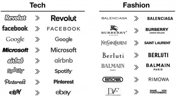
That’s not to say that we don’t like minimal design. Actually, we love it. In the right company, with the right branding, and the right context, minimal design can be exciting, inspiring, creative. But when every.single.logo. is a flat, sans-serif, drab digital offering, it starts to feel like creativity has come to die in the 2020’s. Take Pinterest, Spotify and Airbnb. How about Balenciaga, Balmain and Saint Laurent (Yves Saint Laurent was one of my favourite fashion logo’s so I’m particularly bitter about that one). In the effort to ‘appear discernible onscreen’ we have lost one of the core purposes of branding, personality.
So what has driven the homogenisation of these brands? Is it the designers or the clients? As busy modern people, we claim to have little time for the ‘non-essential’ and once you strip that away, there is only so much left its bound to all start to look the same. What is ‘non-essential’ anyway? As creatives, we argue for the value in ‘non-essential’, because if all that’s left is a humdrum world of corporate robots we’re not really interested in being a part of that. Is beauty essential? Art? How do we create without the mundane, the useless, the extra weight and the ‘fluff’. If we’re all reading the same design blogs, looking at the same websites for inspiration, has the craftsmanship gone. Are designers becoming soulless?
(Image credit: Velvetshark.com)
Or are we pandering too much to the client? If companies are making creative decisions based on statistics and data, do we loose the heart of design? Do we just leave it to the AI to design for us? The client can just type what they want created into a program and let tech do it for them. The desire to conform to 4K, mobile screens and the obsession with favicon has stripped the character from the online world. Should we as designers be champions for the old ways, the nuance of creativity, the need for flamboyance and the purpose of flourish?
I think what is so worrying is the ease in which we all, designers and clients alike, transitioned into the minimal mindset with little pushback. The fall into the sleek, sterile space was so gradual and subtle we didn’t really notice the mass bland brand until it was very much ingrained into day to day life. It felt like a natural modernisation, of course design needed to evolve this way, we let ourselves believe. But Burberry has come along and broken the spell. This is an exciting time to design. We now can creatively solve the challenge of designing to the modern digitisation, but without loosing our soul. Some designer’s will succeed, and some will fail. But this way at least, art has a chance of winning.


