

Full Shelf Games is an adventurous, quality driven board game publishing house, that prioritises combining superb game play and the importance of the players journey with incredible aesthetics to create unbeatable playing experiences.

FSG is an inviting, accessible yet premium brand that assures this first rate experience for its customers, through it’s unfaltering commitment to well polished details, publishing highly engaging games and providing fun, well produced companion content i.e. video reviews, instructions etc.
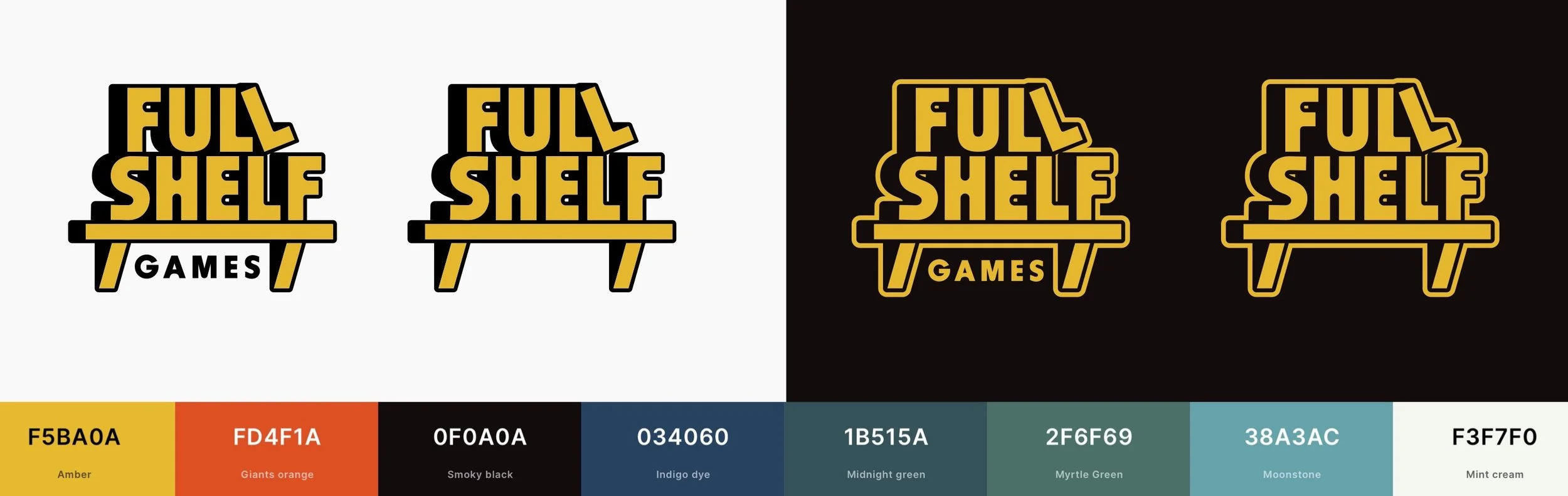
Their colour palette, therefore, needed to match this creativity with a strong and varied array of bright, but not garish, colours.
Primary

Secondary


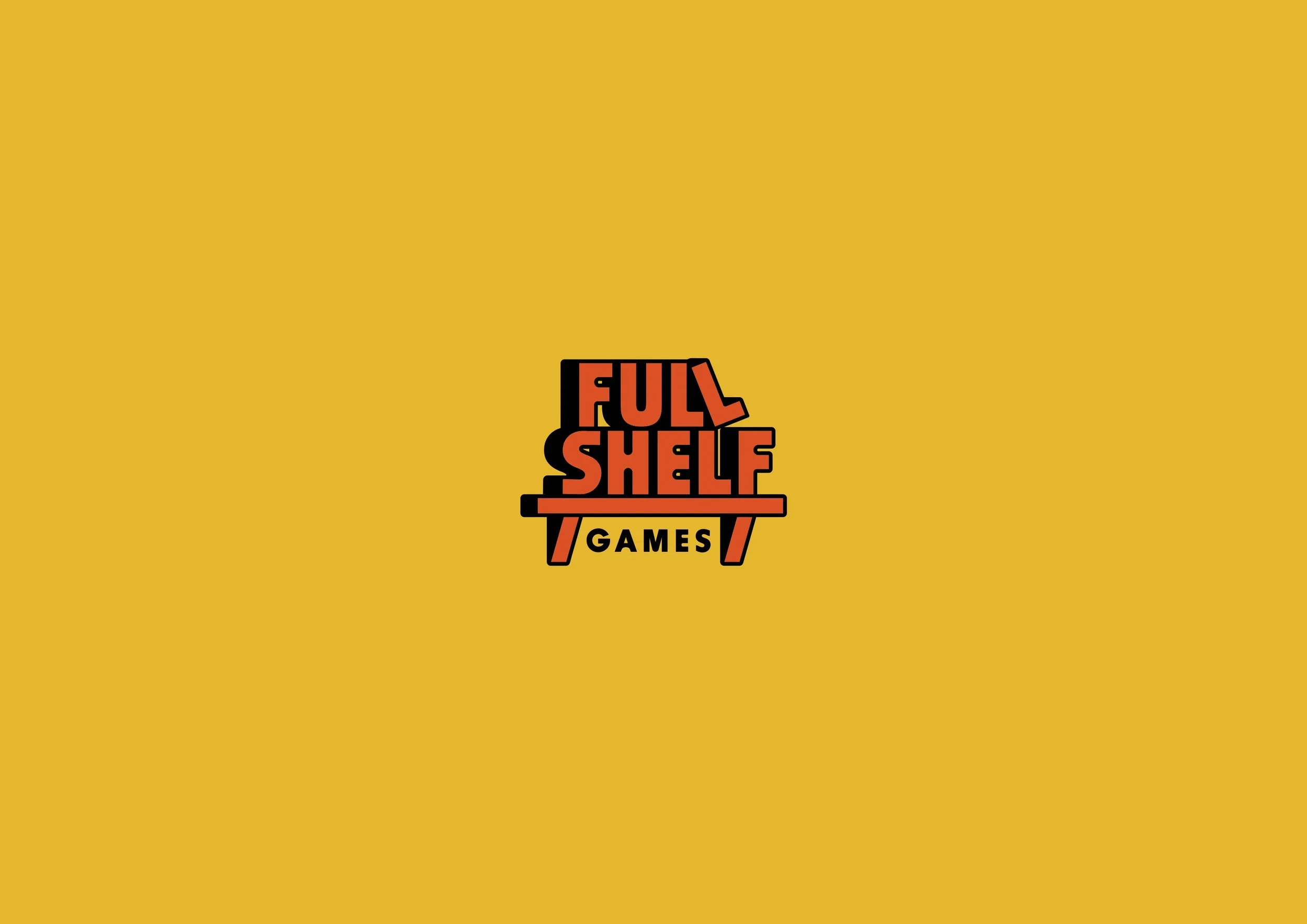
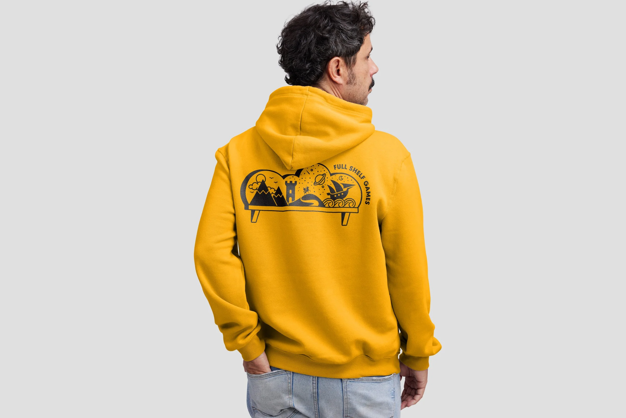
Illustration - fun but polished.
FSG’s brand and product evokes in it’s audience a feeling of discovery that is inclusive, open, exciting, inviting, fun and polished. The illustration for the brand exemplifies this, with a clean but intrepid design that invokes a feeling of nostalgia for their audience.
Variety matters.
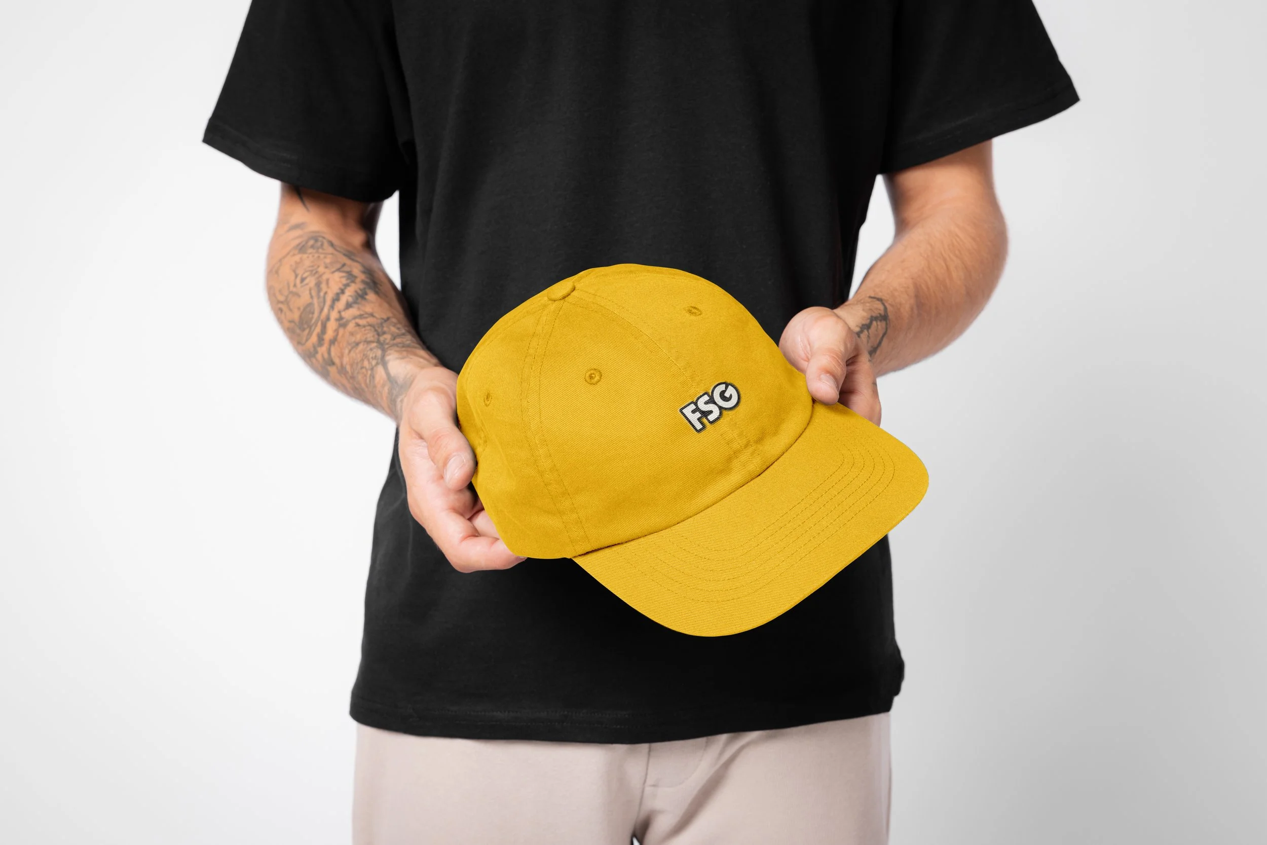
Having a logo that is strong but allows a certain amount of manipulation to fit in a variety of spaces or arrangements is extremely important, especially for a brand that will produce physical products. The FSG logo works both horizontally and vertically stacked, in its illustrated form, and as an acronym. With this and a considered colour palette, the options are vast. Board game designs can vary wildly, so allowing the logo to be changed but also remain recognisable and characterful was a key aspect of the branding.